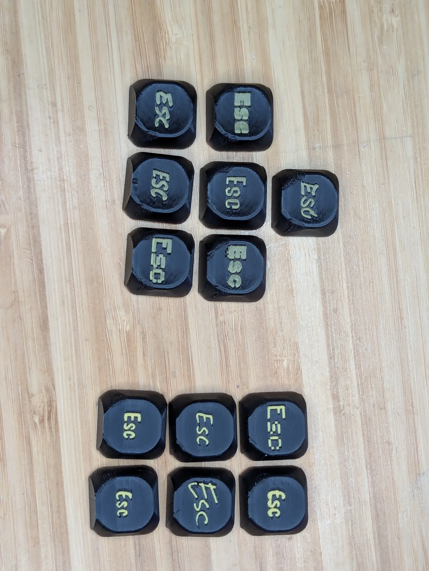
Running some test prints on keycaps using some different fonts, the group on the left(top) was done first with .4mm depth and the right(bottom) was done with a 2mm depth, the colors came out much more vibrant without the black blending in.

Running some test prints on keycaps using some different fonts, the group on the left(top) was done first with .4mm depth and the right(bottom) was done with a 2mm depth, the colors came out much more vibrant without the black blending in.
Running some test prints on keycaps using some different fonts, the group on the left(top) was done first with .4mm depth and the right(bottom) was done with a 2mm depth, the colors came out much more vibrant without the black blending in.